Atap Street Coffee
DS Borneo
Atap St Coffee is a brand created by DS Borneo Trading Sdn Bhd in Malaysia. They import food & beverage from overseas and also have their own brand of coffee and chocolate drink.
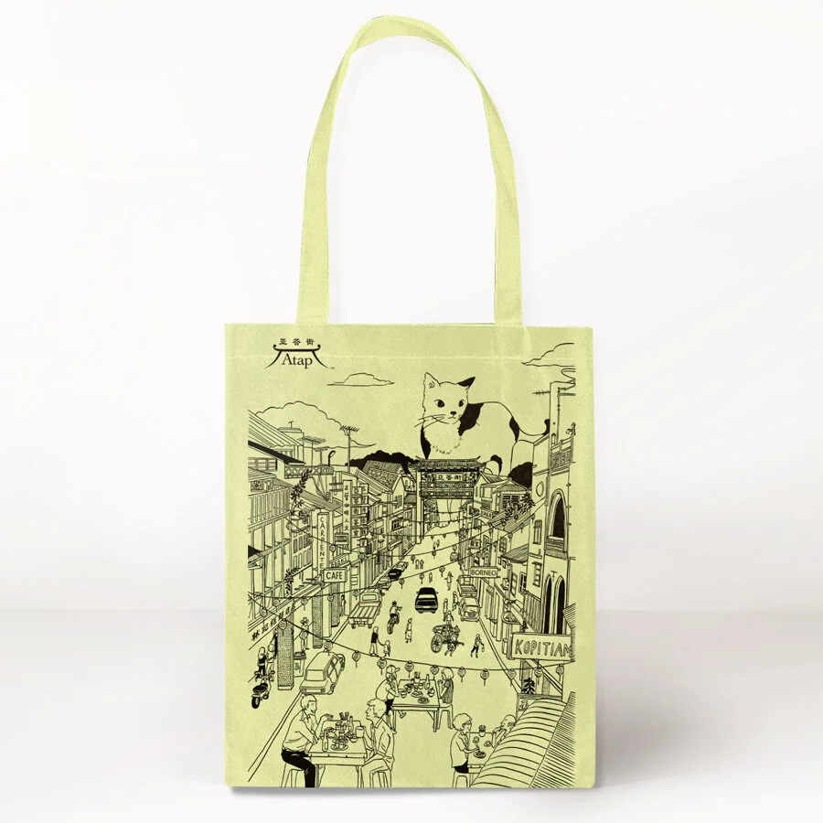
The illustration depicts the city Kuching, which means "cat" in the Malay language, so the people usually refer to it as "cat city". However, by checking Wiki, there are different theories why it’s called Kuching, which is why there’s a roundabout with cats on it. It’s a small city located within Borneo, Malaysia, with a mix of Chinese, Malaysia and natives. The Mandarin name is 古晉. The coffee's brand name ‘Atap St’ is taken from an old street in Kuching. There’s actually a gate at the beginning of the street with the name on it, the other name of it is Carpenter Street. We can probably get the feeling that the stores are as old as the buildings themselves. Those buildings are what people called 五腳基 in Malaysia and Singapore.

Sketch
-

Sketch A
This image views the city from east to west along with the Waterfront, Atap St. on the right and legislative building on the left. The Carpenter St. is the second row from the riverbank, so it is marked by the hanging lanterns. To match the geography, the harmony arch couldn't show up but I move it to the front, making it bigger like spotting it. There are also some unique architectures in the cityscape which is well recognized in Kuching.
Since Atap is a coffee brand, the old-style barista and the impression of the coffee itself would be more important. So this image integrates the barista, old-style coffee and the Sarawak river together. Simply and strongly showing the city, the coffee and the brand.
-

Sketch B
The second draft depicts the cat city and the local daily life. This is the opposite view from the west to the east, so the river curves in a different way, making it more smooth. The main bazaar becomes scaled to light up the houses, carpenter st., the temple, the arch and the Kopitiam. There's also an old-style coolie to match the past time and make the atmosphere tuneful.
The landscape shows the city Kuching with many green fields and the peaceful fluid of the Sarawak river. The agile cat jumping gracefully on land, giving the image sound and movement.
The logo crosses along the river as a bridge above.
-

Sketch C
The last one is a lower aerial view of Atap street, which shows the feature of the architecture, 五腳基, better. Since the perspective is closer and lower, the people and their activity are clearer and more varied. Some are eating, drinking coffee, and some riding bike or walking under 五腳基. The name of Kopitiam and Borneo can also be decorated on the sign.
This image also depicts the cat city. The cat's shape and its sight make the line of the image longer and further.