Branding | The Isle Bookstore
嶼伴書間
The Background
The Isle Bookstore is an independent bookstore that newly opened its door in the country of I-Lan, Taiwan in 2021. Operating by a family of 3, mum, dad and their 7-year-old girl, they expected the space to become a connection of sharing the topics they care about, such as children’s rights, local culture&history and cinematography(which is dad’s profession), through the authentic selection of books.
8 months ahead of their opening, the family approached me to create the logo, business card and various ideas of merchandises and marketing collaterals.
The Brief
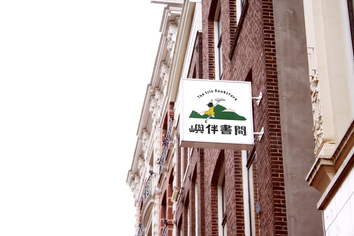
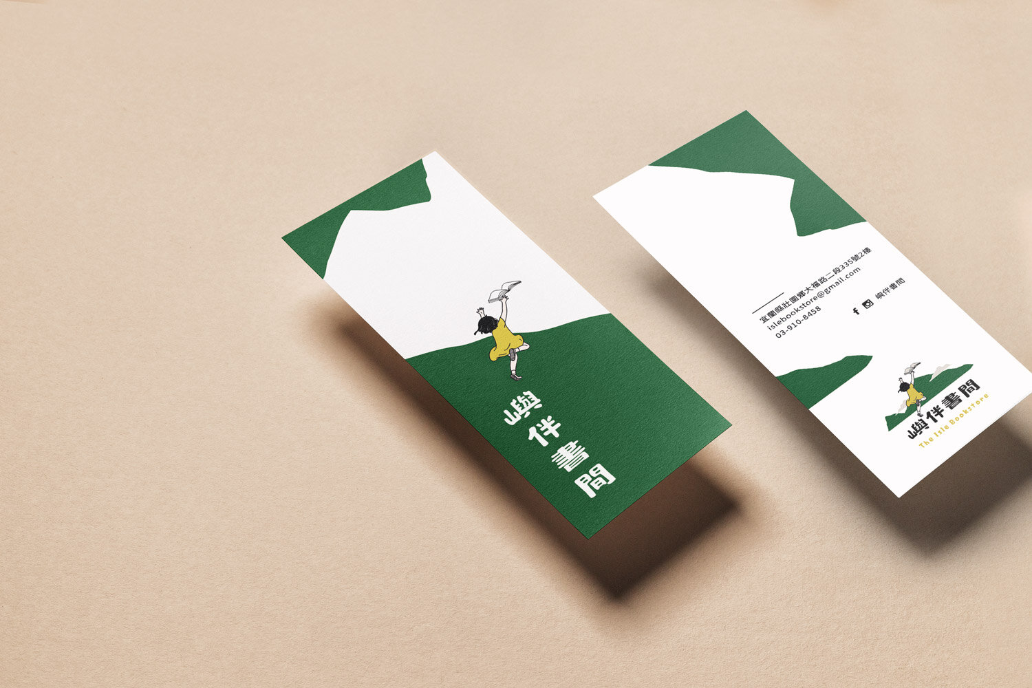
They had developed a specific scenario of the logo before our first meeting: A girl chasing a flying book on an island.
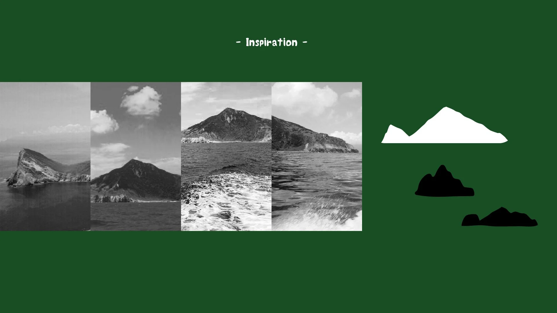
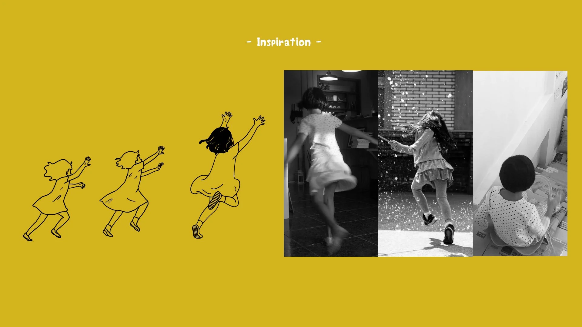
With the background of cinematography and film lover, my clients wanted the logo to be more crafty, realistic and storytelling rather than combining clear shapes and symbols. Besides description, they also provided me with their hand drawings that showed how they developed the scenario and concepts. We had a deep conversation about their experience, the reasons that lead them to relocate and start a bookstore, and what they have learnt and changed during the COVID pandemic.
The meanings of the 4-character name in Mandarin: 嶼 伴 書 間 - Island, Companion, Bookstore, Space.
The Solution
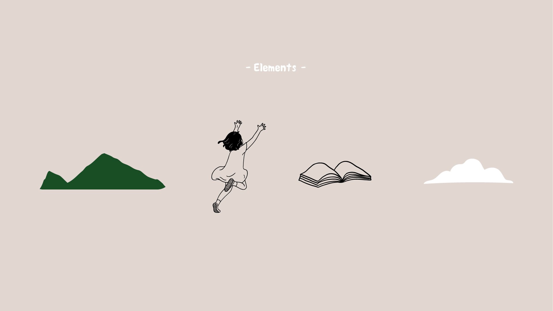
By clear communication and well understanding of my clients and the local community, I developed a custom typeface and a scenario of a girl(person) chasing(action) a flying book(object) on the island(place). To ensure every detail was satisfied, I provided 3 different options of typefaces and images on the sketch stage, and 2-3 similar options to decide the gestures of the girl, the shape of the island and the position of the book after we had a clearer design direction.
To balance the proportions of the elements, the girl stepped out of the island instead of “on” the island, which also added a sense of dimension and the feeling of freedom. The elements of the logo can work together with various combinations as well as be used separately to fit different designs.
The Happy Outcome
The logo was loved by the family(their daughter said she loved the gesture of the girl and the colour of the island) and immediately rolled out to social media, business card, signage and packages. On this project I also assisted with the finished arts, communicating with the printers, and advices on the store’s interior design.
是書店,賣老闆喜歡的書;
是空間,做老闆喜歡的事;
是島嶼,在浩瀚未知中求知的立足地;
是陪伴,在同與不同中激出可能的火花。
— 書店老闆一家


Merchandises & Marketing Collaterals


“ 謝謝朋友願意接下了後續更繁複的設計工作,也不厭其煩地與我們開線上會議及反覆確認彼此的意思沒有誤解,更是正面回覆我們各種想像與不確定,採取直接畫給你看的方式來進行。島嶼的形式、書本如何飛及數量位置與曲線的挪移以及文字線條選擇都有各種討論,就連小孩圖的年紀姿勢設定都畫了好幾版來做討論與確認,而且樂樂(女兒)每次一起開會提的建議也都好好地被回應了。
經過囉唆一家人與心好插畫家漫長的各種討論後,logo千辛萬苦地現身囉囉囉!
樂很喜歡,我們也很喜歡。樂說:我最喜歡這個小孩的姿勢跟山的顏色。
謝謝 Peichi Wu Illustration 的耐心與條理分明,還有謝謝每次都會聽到樂的聲音並回應她。”
— Ching Tsai, Owner, The Isle Bookstore